Thursday, October 1, 2009

BLog Post #6


I have recently started focusing my photography on food. A couple weeks ago I worked on a Rocco Dispirito cookbook shoot with the photographer Kritsada Panichgul (www.kritsada.com). Kritsada is an immensely talented photographer and it was a wonderful experience learning from him and also working with Rocco. The experience has pushed me in this new direction as an aspiring food photographer.

This is an image of an openfaced sandwich I made for breakfast. It is my version of an Argentine classic, the choripan, converted into a breakfast sandwich. From bottom up there is a toasted piece of bread, grilled lettuce and onion, sliced tomato, chorizo, over-easy egg, drizzled with some chimichurri. It encompasses most of the things I love about food.

Being raised in an Argentine family, I developed a love for simple food that aims to highlight the natural flavors of quality ingredients. What puts this over the top for me is the over easy egg. A runny egg yoke might be my favorite breakfast item, I even like it more than bacon.

This is an image with personal value to me. It illustrates the foods I love while also illuminating my heritage and demonstrating how that heritage influences my creative ideas into the future.

Buen provecho.


--

Monday, August 3, 2009

Blog Post #5


I shot this image in Washington DC the day of President Obama's inauguration. I noticed this trashcan on the sidewalk near the Mall where I watched the inauguration.

What does this image say? Obviously it says a variety of things. Specifically, I think it reflects the fast-paced nature of our culture. The majority of that trash is "to-go" containers. We are always in a rush and need to get our coffee on the go. We don't have time to sit and drink our coffee human-style from a mug while sitting at a table. We are also too lazy and unconcerned to invest in a reusable containers. So we just grab the Starbucks, pour it down our throat during the commute and toss it to the curb when we're done. Magically, those trashcans on the sidewalk are always empty by the next morning. If there are too many of us is one place at one time, like in Washington DC on January 20th this year, the trash does not disappear fast enough and we get ugly sites like the one above.


--

Monday, June 29, 2009

Blog Post #4

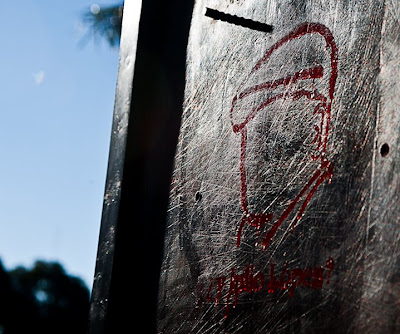
In this post I will revisit the theme of graffiti and street art that always fascinates me. Recently I spent a week in Buenos Aires, Argentina. Something I always notice in Buenos Aires, and also in most other countries outside the United States, is that the graffiti is much more explicitly political. Over time, the graffiti I have seen in Buenos Aires has developed artistically. In past visits, I found that it lacked creativity and were just words written on a wall attacking the government. This trip there was much more visually creative work, resembling much of what I see in my neighborhood in New York.

This stencil reflects a progression into a modern style of graffiti while still maintaining the political activism that is always present. I saw this stencil and others with a similar message in many places throughout the city. It reads "¿Y Julio López?" Which translates to, "And Julio López?" it is referencing the 2007 disappearance of Julio López. López had “disappeared” for the first time from 1976-79 during the infamous era of military dictatorship in Argentina.

About 30 years after the era of “disappearances,” the Argentine government finally began to prosecute those responsible for the Diry War. López was a key witness against the first defendant, Miguel Etchecolatz, the Director of Investigations of Buenos Aires Provincial Police under the military government. López “disappeared” hours before he was supposed to give his final testimony. Fortunately, Etchecolatz and many others were convicted despite not having López’ last testimony, but López is still missing. The national government and Buenos Aires provincial police have made very little progress in finding López.

Returning to the theme of graffiti, this piece demonstrates a progression in the artistic quality of graffiti but still maintains the explicitly political nature. For me, this is a more effective use of the medium to convey the message. It is an interesting design that has artistic value independent of the message.


--

Monday, April 20, 2009

Blog Post #3


I shot these portobello mushrooms at the farmers market in Union Square over the weekend. Mushrooms are not my favorite food to eat, but they are among the most intriguing vegetables to look at. They come in many unique shapes and usually have an interesting texture.

I chose to photograph the crate of portobellos because I was impressed with their size and the light was hitting them very nicely. Looking deeper into the many different portion of mushrooms in that specific crate, I found many different inspirations.

I still have not figured out what exactly this frame means. The first thing that strikes me is how it almost deconstructs the mushrrom and displays it without showing a single complete mushroom. There is the stem on the right side, the top in the bottom left corner, and the ridge in the center.

Another thing that draws my attention is the space between the two mushrooms in the middle of the frame. That is where the story of this image begins. I see a body of water separating to foreign lands. I also see shelter for the homeless. I also see a river feeding farmland making it fertile. I also see a forrest getting buldozed. I also see a pile of portobello mushrooms.


--

Tuesday, March 24, 2009

Blog Post #2

(Click image to view larger)

I walked by this piece on the sidewalk on 4th street between 1st Avenue and Avenue A last weekend. The first thought that popped into my mind was, "wow, that's a pretty cool looking flower."

As an artist that uses photography as my medium, my challenge is framing the world
everyone sees in a way that illustrates the idea I want to share. This image illustrates the ideal layout of a modern city, using the perspective of a bird's-eye view. There are highways leading into the city. A bright and vibrant downtown area surrounded by a densely populated and cultured residential area. The key idea is how the city is built from within and continues to develop within space and avoids sprawling beyond the boundaries.

Monday, March 16, 2009

Blog Post #1 :


I have recently been working on a portrait series examining the relationship between artists and graffiti. I have developed some interesting conversations with my subjects regarding the evolving value of graffiti in our culture. The root issue in many of these conversations is identifying the distinction between a mural and graffiti. The American Heritage Dictionary defines a mural as, "A painting or photograph applied directly to a wall or ceiling." The same dictionary defines graffiti as, "A drawing or inscription made on a wall or other surface, usually to be seen by the public." I struggle to fully understand this distinction and these definitions, in addition to the many others I've found, fail to enlighten my thoughts.

Twenty years ago the distinction between murals and graffiti was simpler than today. A mural was a commissioned work whereas graffiti was vandalism. Over time graffiti has gained cultural respect and is now being commissioned for storefronts, billboards, or to just decorate a schoolyard like the one on 106th and Park. How does the evolving role of graffiti influence the artform? If it is commissioned, is it still graffiti or is it a mural in the style of graffiti? What role does legality play in defining the artwork? I don't know right now, I'll get back to you.

I was busy with other things the last couple weeks so I haven't thought about this idea much, but the other day I came across this scene on the corner of 10th and 4th ave। It appears as though graffiti artists themselves are battling this same idea. Perhaps I am reading into it too much and it's just a guy named mural tagging a large brick wall. I don't think that's the case. In the Image I see a statement that graffiti deserves respect as an artform, just like murals. I chose to compose this image in this way to illuminate that message. The man walking his dog serves to reiterate that graffiti is something that decorates the streets we walk on everyday.


About Me

My photo

Jonathan Meter is a freelance photographer and artist with a keen insight into the human spirit and a unique perspective on the world around him. Jonathan’s vision allows him to see the potential in the mundane and elicit beauty, movement and life from the unexpected. The abstract images Jonathan creates illustrate the integration of music into his work, as he uses rhythm and melody to channel the essence of an object and capture its energy in a still image. Through his photographic art, Jonathan tells his own story, conveying his creative ideas and understanding of the world through the use of color, light and rhythm.

Jonathan’s work is driven by his passion for illuminating his subjects’ past, present and future in a single image. His open mind and natural thoughtfulness allow him to evoke his subjects’ genuine emotions and essential personalities in both posed and candid shots. Fascinated by the relationship between photographer and subject, Jonathan seeks to capture his subjects in the context of their life history, and thereby communicate that history to others through his work. Jonathan grew up in Philadelphia, PA and currently lives in New York City.